THE NIGERIAN RAILWAY E-TICKET WEBSITE
A CASE STUDY AND USER EXPERIENCE COPY REWRITING[note that this is a personal project and in no way the property of the NRC]
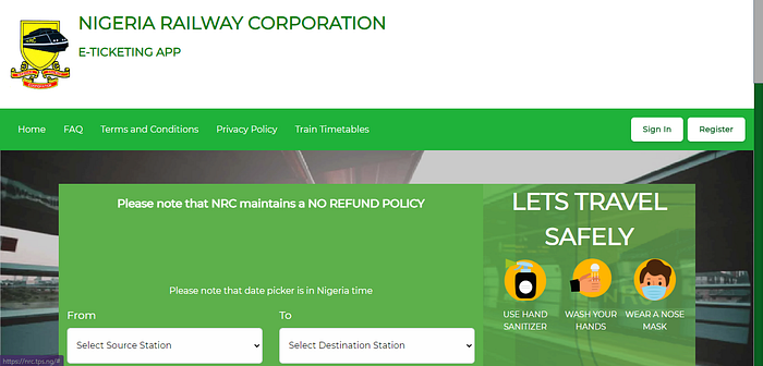
The NRC e-ticket website helps users buy tickets for their train rides,The site is easy to use with little to no hassle. However the first time I tried to use the website, I didn’t fail to notice that the ux copies were neither conversational nor precise. These are some of the errors i spotted:
COPYEDITING

PROBLEM: The copy that seeks to portray that the problem being experience on the IOS app drags on and might be confusing to the user. It contains grammatical errors and doesn’t easily communicate solutions. It also lacks a friendly and conversational tone.
SOLUTION: I rewrote the copy to convey the same message while remaining simple, conversational and concise.


PROBLEM: The information presented on two slides can be easily fit into a single message
SOLUTION: I merged the two slides into one simple message.


PROBLEM: Although this page seeks to help passengers travel safely, the instructions are arranged in a misguiding way.
SOLUTION: I rewrote the instructions and copies.


PROBLEM: To have an effective copy, clarity needs to be prioritized. The copy lacks this effect.
SOLUTION: I rewrote the copies to be more concise.


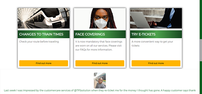
PROBLEM: One look at the page shows that there is a repetition of information. This distracts users from the message the copy intends to pass across.
SOLUTION: Rewrite copy to be concise.


PROBLEM: Copies appear to be unclear
SOLUTION: I rewrote the copies to be more clear.


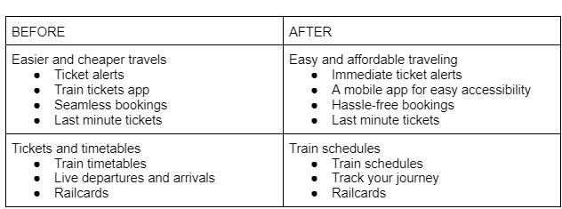
Although the last page of the site doesn’t have any significant problems, I decided to rewrite the copies because I believe they could be better.

The NRC e-ticket app copyediting was done as an attempt to improve on my User Experience writing. I am open to collaborations and you can hit me up on twitter @a_adefolake
